What's Wrong With Sputter?
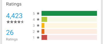
A few days ago one of those highly encouraging one star reviews was posted on Google Play. As usual it did not go into any detail and was more along the lines of “This sucks!”.
Of course one should not take things like this too personal and I am certainly not the only one experiencing incidents like this. All in all Sputter is actually in quite good shape when it comes to ratings.

But it got me thinking: What if the user is right?
There are indeed some areas where Sputter has big room for improvement. Let’s go through some of them.
Responsive layout
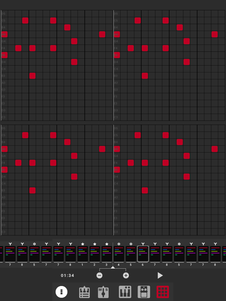
Sputter was originally designed to be run on phone screens only. It is usable on tablets too, but does not make good use of the additional space. This is what it would look like on a medium sized tablet:
The grid is way too big and there is a lot of wasted space in the area under the patterns. Also, the play/pause button is still hidden in the main menu with all that space available.
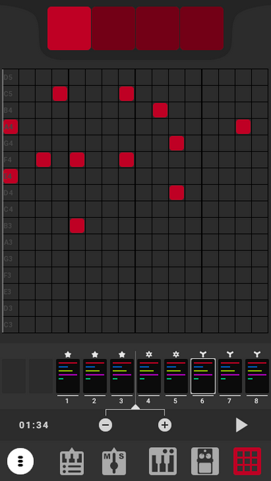
Several users have also requested support for portrait layout as it right now only works in landscape. At some point I took a stab at it and came up with a redesign allowing for portrait mode:

It is by no means finished, but it is a start and probably an indication of where it is going.
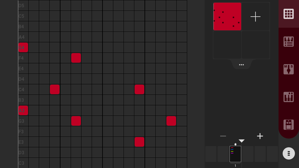
For tablets and bigger screens something like this could possibly work:

Instead of having the red square shortcuts to each pattern in a group, all four patterns in each group could be visible at the same time.
Contrast
Sputter’s color palette is intended as a dark mode theme. However, it seems like it has ended up on the deeper end of the grey scale. Try going outside in the sun and fire up Sputter. Then take a look at for example the YouTube app. Even with YouTube in dark mode it is still way more visible and legible than Sputter.
This probably has something to do with the rather dim primary colors in Sputter. It will be adressed in the portrait/tablet redesign revision.
No free entry point
One major drawback of Sputter is that there is no way of trying it without paying up front. As a mobile app user myself I clearly understand the need to know what you are going into before shelling out $5.
Nowadays the conventional way of doing this is having the app download free with in-app purchases and paid upgrades. Personally I prefer paying up front and getting the 100% full package and highly dislike seemingly endless IAP schemes and subscriptions.
I am considering different alternatives, preferably without in-app purchases. One way could be to have a highly simplified version of Sputter which was unconditionally free, possibly under a different name. Kind of like what Tinkercad is to Fusion 360.
Performance
A dark secret of Sputter is that it does not implement the holy grail of audio programming. On modern devices nowadays it works quite well despite this, but optimization is always desirable. For example we still want to save battery power and it would be cool if Sputter could be run on some really tiny computers like the Raspberry Pi Zero 2W. Also, when a free entry point as mentioned above becomes available, it is typical that users with very low spec devices will install the app and have very bad experiences if it is not well optimized.
The sequencer and audio engine will be revised in the foreseeable future. This will improve performance and playback latency.
When will this be implemented?
Even with the one star review earlier this week I will not jump out of my chair and implement any of this immediately. Currently I am working on implementing file backup and improving file handling in Sputter. When this is done, which probably will be sometime this spring, I will start working on the performance issues.
Other issues?
These are just what I can think of at the time of writing. If you are missing something in Sputter do not hesitate to reach out to me at support@casualcomputing.info. We also have a subreddit and a public issue tracker where you can put forward your complaints :)
